Predicting Poverty in America
Introduction
Poverty is a major problem in America. According to the Census Bureau, around 10% of Americans live in poverty (for a family of four, this means having an annual household income of below $26,500), and that number increased in the past year [2]. Our goal is to determine which factors are the biggest indicators of poverty. A study done by Methodist University concluded that some of the biggest indicators of poverty are growing up in a single-parent household, living in a state that invests little in education, living in a high crime area, or living in an area with high unemployment [1]. A paper written by Berkeley had similar findings. In addition to growing up in a single-parent household, this paper also found that race and ethnicity as well as parental level of education were strong indicators of poverty [3]. While the US system of defining poverty has been criticized, the Census Bureau’s parameters for poverty is what this project will use as its basis.
Problem Definition
For such a wealthy country, poverty should not be a major problem. Given this is not the case and the prevalence of poverty in America, our goal is to determine which factors are the strongest predictors of poverty so that our findings can be used to make a difference. We will analyze the impact of individual living conditions and choices as well as the impact of regional, economic, social, and environmental factors. We will use this information to develop a model which will give a prediction of a county’s poverty status based on these different features. In doing so, our goal is to be able to provide evidence for which areas and factors local, state, and federal governments should focus on to decrease the poverty rate in America.
Data Collection
We used several sources to collect data. In collecting data, we first needed to decide on which features we wanted to have. Deciding on these features came from some preliminary research, studies, and articles that we read. Ultimately, of the different things related to poverty, we chose to include the following as features: if the area is an urban or rural area, how many housing units per capita are in the area, what percentage of people are too far from a grocery store in the area, what the crime rate per 100,000 people is in the area, what the housing price index is in the area, what the median house price for 1 family is in an area, what the average house mortgage for 1 family is in an area, the number of hospitals in an area, how much a particular area spends on education per capita, what percentage of people in an area have access to internet, what the population of an area is, what the unemployment rate of an area is, what the homelessness rate per 10,000 people is in an area, how many people complete college in an area, what the rate of not completing high school in an area is, the number of people on full medicaid in an area, the total number of people on any kind of medicaid in an area, the percent of people receiving Supplemental Nutrition Assistance Program (SNAP) benefits in an area, and the broadband access in an area. We broke these features down by county for counties across the United States. We then looked at the estimated poverty level for each of these counties and assigned it a label based on how impoverished the county was.
To collect our data, we used several sources. We mostly used government websites and Kaggle to collect our data, but we also used a few other sites as well:
- Estimated poverty level by county: https://www.census.gov/data-tools/demo/saipe/#/?map_geoSelector=aa_c
- Urban or Rural: https://www.ers.usda.gov/data-products/food-access-research-atlas/download-the-data.aspx
- Housing units per capita: https://www.ers.usda.gov/data-products/food-access-research-atlas/download-the-data.aspx
- Percentage of people too far from a grocery store: https://data.world/usda/grocery-stores and https://www.ers.usda.gov/data-products/food-access-research-atlas/download-the-data.aspx
- Crime rate per 100,000 people: https://www.kaggle.com/mikejohnsonjr/united-states-crime-rates-by-county
- HPI in the area: https://www.fhfa.gov/DataTools/Downloads/Pages/House-Price-Index-Datasets.aspx
- Median house price for 1 family: https://www.nar.realtor/research-and-statistics/housing-statistics/county-median-home-prices-and-monthly-mortgage-payment
- Average house mortgage per month for 1 family: https://www.nar.realtor/research-and-statistics/housing-statistics/county-median-home-prices-and-monthly-mortgage-payment
- Number of hospitals in an area: https://data.cms.gov/provider-data/dataset/xubh-q36u
- Education spending per capita: https://www.kaggle.com/noriuk/us-educational-finances?select=states.csv
- Percent access to internet: https://www.census.gov/data/tables/2012/demo/computer-internet/computer-use-2012.html
- Population of an area: https://www.census.gov/programs-surveys/popest/technical-documentation/research/evaluation-estimates/2020-evaluation-estimates/2010s-counties-total.html
- Unemployment rate in an area: https://www.bls.gov/lau/
- Homelessness rate per 10,000 people: https://www.kaggle.com/umerkk12/homelessness-in-us
- Rate of completing college in an area: https://data.ers.usda.gov/reports.aspx?ID=17829
- Rate of not completing high school in an area: https://data.ers.usda.gov/reports.aspx?ID=17829
- Number of people on full medicaid: https://www.cms.gov/Medicare-Medicaid-Coordination/Medicare-and-Medicaid-Coordination/Medicare-Medicaid-Coordination-Office/Analytics
- Number of people on some type of medicaid: https://www.cms.gov/Medicare-Medicaid-Coordination/Medicare-and-Medicaid-Coordination/Medicare-Medicaid-Coordination-Office/Analytics
- Percent of people that receive SNAP benefits: https://www.ers.usda.gov/data-products/food-access-research-atlas/download-the-data.aspx
- Broadband access in an area: https://techdatasociety.asu.edu/broadband-data-portal/dataaccess/countydata
As stated above, we used this data grouped by county. There are just over 3,000 counties in the United States, and we collected some or all of these features for as many counties that had the information as publicly available as possible.
Each of these features may or may not have a strong correlation to poverty. We suspected having a high unemployment rate, low access to Internet, and low access to food would indicate an impoverished community, but we wanted to test how strongly they correlate.
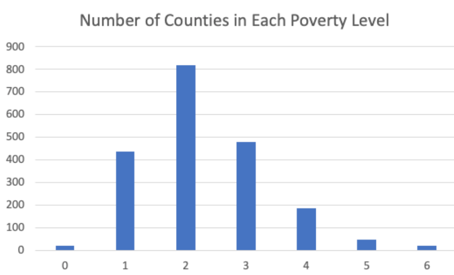
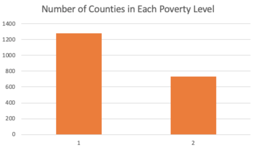
As we will further discuss below in the methods section, we broke the labels down into different categories based on the poverty rate of an area where the smaller label value represents an area with less poverty and the larger label value represents an area with more poverty. We ran our neural net with 7 labels (0 - 6) and with 2 labels (1 - 2). When we used 7 labels, we broke up the counties every 5% increase in the poverty level (i.e. 0: 0-5%, 1: 5-10%, 2: 10-15%, etc.). When we used 2 labels, we broke up the counties by those under the median poverty rate in our data and those over the median poverty rate in our data. These are the total counties that fall into each labeled category. 7 labels:
2 Labels:
Methods
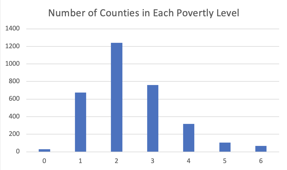
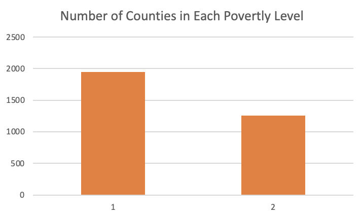
Before building our models, we had to do some data-preprocessing and feature engineering. In looking at the features for the different counties, some counties had many features that were missing because the data points were not publicly available. We were able to find data for all of the features for 2,007 counties, but there are just over 3,000 counties. In order to maintain the over 3,000 datapoints we should have, we implemented a linear regression model. This model was used for each feature that had a 0 or null value. To run this model, we utilized our dataset of 2,007 datapoints as our y_actual for these features and our x dataset consisted of the features that had 0 or null values. After using linear regression for all data points and using their predicted values, we increased our dataset from 2,007 datapoints to 3,200 datapoints. This is what our label break down looked like after running linear regression and adding over 1,000 additional datapoints. 7 labels:
2 Labels:
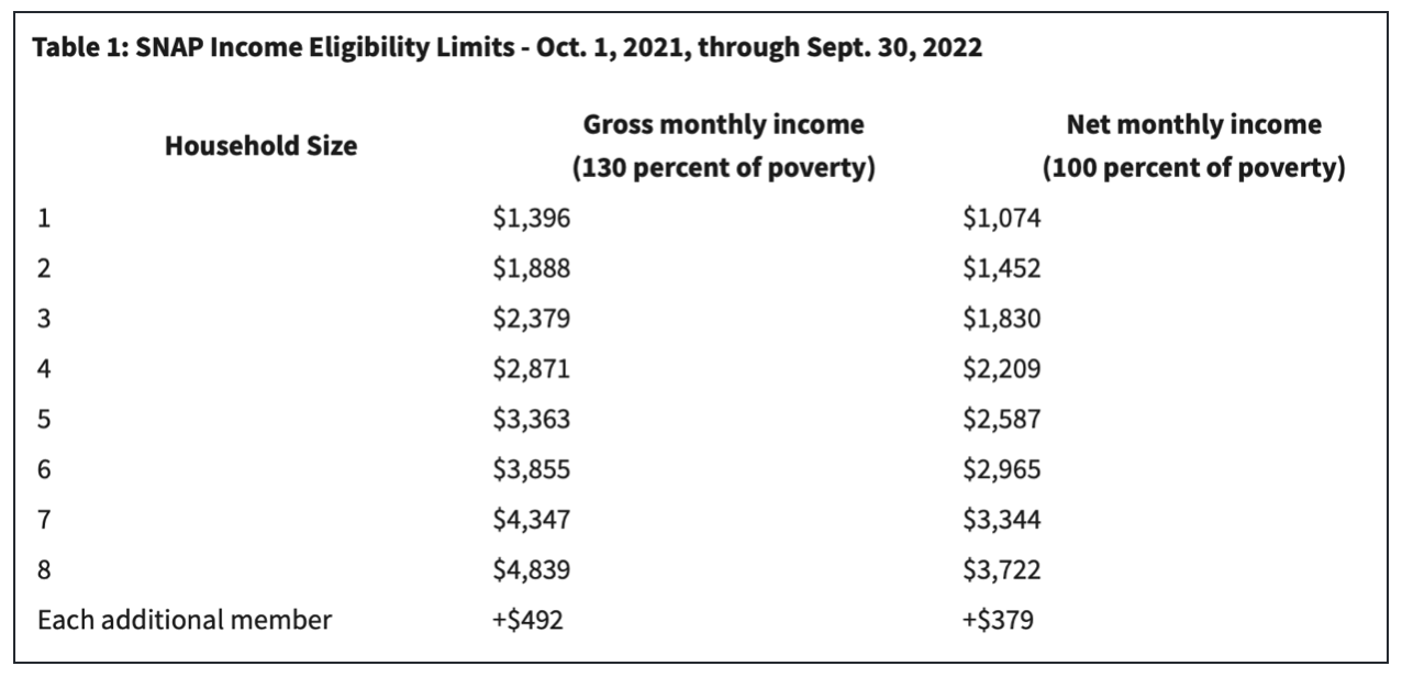
While we did run linear regression to capture these extra datapoints, we also ran our models with the eliminated ~1,000 counties that did not have publicly available data for every feature to compare the results. Next, we looked at each feature we collected data on and decided if there were any we wanted to eliminate before actually running the different learning algorithms. Our goal was to use different features to predict how impoverished an area might be. Because being enrolled in medicaid or receiving SNAP benefits is a clear indicator that one is in poverty, we decided to eliminate those features. We wanted to focus on more causal factors that might influence an area’s level of poverty or cause that area to be more impoverished (i.e. how well educated the area is) rather than how many people are actually already in poverty in the area. As we can see below, these are the income requirements to qualify for medicaid:
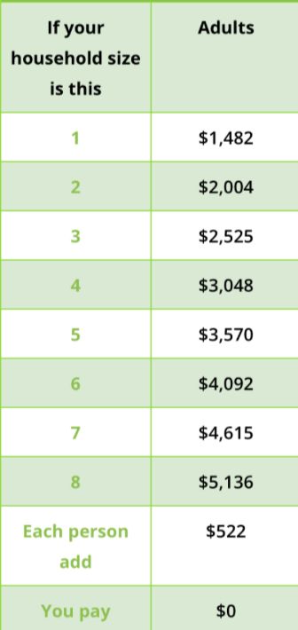
which means that the majority of those receiving medicaid are in poverty. As we can see below, these are the income requirements to qualify for SNAP:
which like medicaid also means that the majority of those receiving SNAP benefits are in poverty.
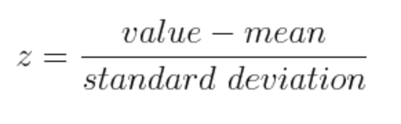
After doing this preliminary data cleaning and feature engineering, we ran principal component analysis (PCA) to perform dimension reduction. Before running PCA, we normalized the data for each feature using the following formula:
After this, we ran PCA using the following library: https://scikit-learn.org/stable/modules/generated/sklearn.decomposition.PCA.html#sklearn.decomposition.PCA
After running PCA to decide on the best features, we created a three-layer neural network. The three layer neural network consisted of a dense node RELU layer (1 node per number of input features we were running the neural network with) followed by another dense node RELU layer with 7 nodes and finally a softmax layer (1 node per number of output labels we were running the neural network with). We first ran the neural network with all 16 features and 7 labels, where each label corresponded to a poverty level. We then ran the network with 16 features and 2 labels, where each label corresponded to a poverty level above and below the median poverty label. We did this for both the non-regressed and the regressed data. We also experimented with adding in a normalization layer to normalize the data before running the network. We then repeated the same process with only the features identified from running PCA. Below is a summary of what our model looks like:
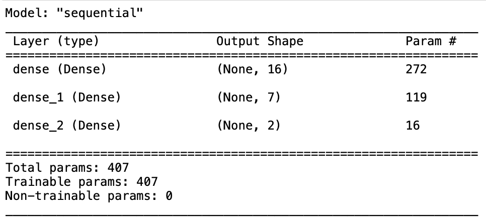
The input size, output shape, and number of parameters changed based on the number of nodes we were using as explained above. In addition to this, we also added an SGD optimizer to our model with a learning rate of 2e-7 and a momentum of 0.9. Our model also ran with the categorical cross entropy loss function. In actually training and testing the model, we split the data up to be 70% training data and 30% testing data. We then trained the model and tested it with 100 epochs.
After creating and running the neural network, we also created a decision tree to map out which way each feature influences poverty. We limited the max depth to 6 so that we could generate an understandable visual. We only ran this model for mapping all 16 features to the 2 poverty labels (one being below the median poverty level and the other being above it). We did not run it with the 5 most important features identified from PCA because we wanted compare how the most important features identified from the decision tree compared to the most important features identified from PCA. This is why we also extracted and created a visualization of the feature importances. To run our decision tree, we used the following sklearn library: https://scikit-learn.org/stable/modules/generated/sklearn.tree.DecisionTreeClassifier.html
Results
Dimension Reduction Results
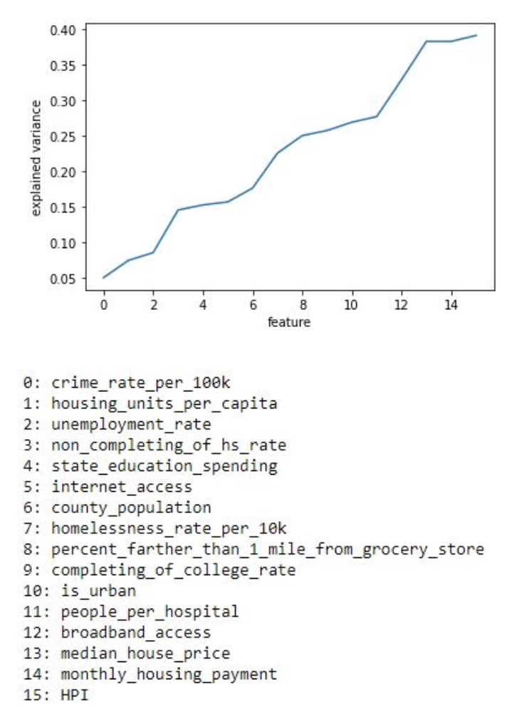
After data collection, we ran Principal component analysis (PCA) twice on our dataset with our 16 constructed features. The output of PCA resulted in a list sorted in order from features that contained the least variance to those with the most variance. The top 5 features identified from PCA with the greatest variance were housing price index (HPI), average monthly mortgage housing payment, median housing price, broadband access in an area, and people per hospital. This means these 5 features have the most correlation to being impoverished out of the total 16 features we used. We plotted the variance that each feature produced below which concludes our above statement.
We have also made a visualization to see similarities between the data points using PCA. One of the visualizations is using a mapping of poverty levels into 7 labels. The other visualization is using the mapping of poverty levels to 2 labels, where it is 1 if it does not surpass the median threshold and 2 if it is higher.
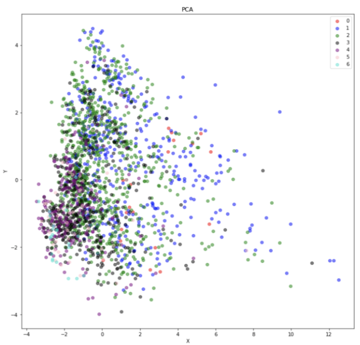
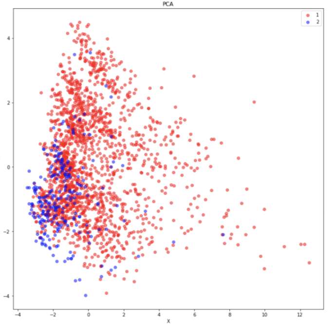
The result from our PCA visualization shows our data is sparse and cluttered in some areas which is not the greatest result. A great example of PCA being showcased is shown below using the MNIST dataset by https://towardsdatascience.com/dimensionality-reduction-toolbox-in-python-9a18995927cd:
The results of our PCA may be rising from our imbalance in our labels. As shown above, our visualization of PCA had a significant amount of labels associated with 2 and 1 in the images respectively. We may be able to adjust our results by including a more even dataset with respect to the labels.
Neural Network Results
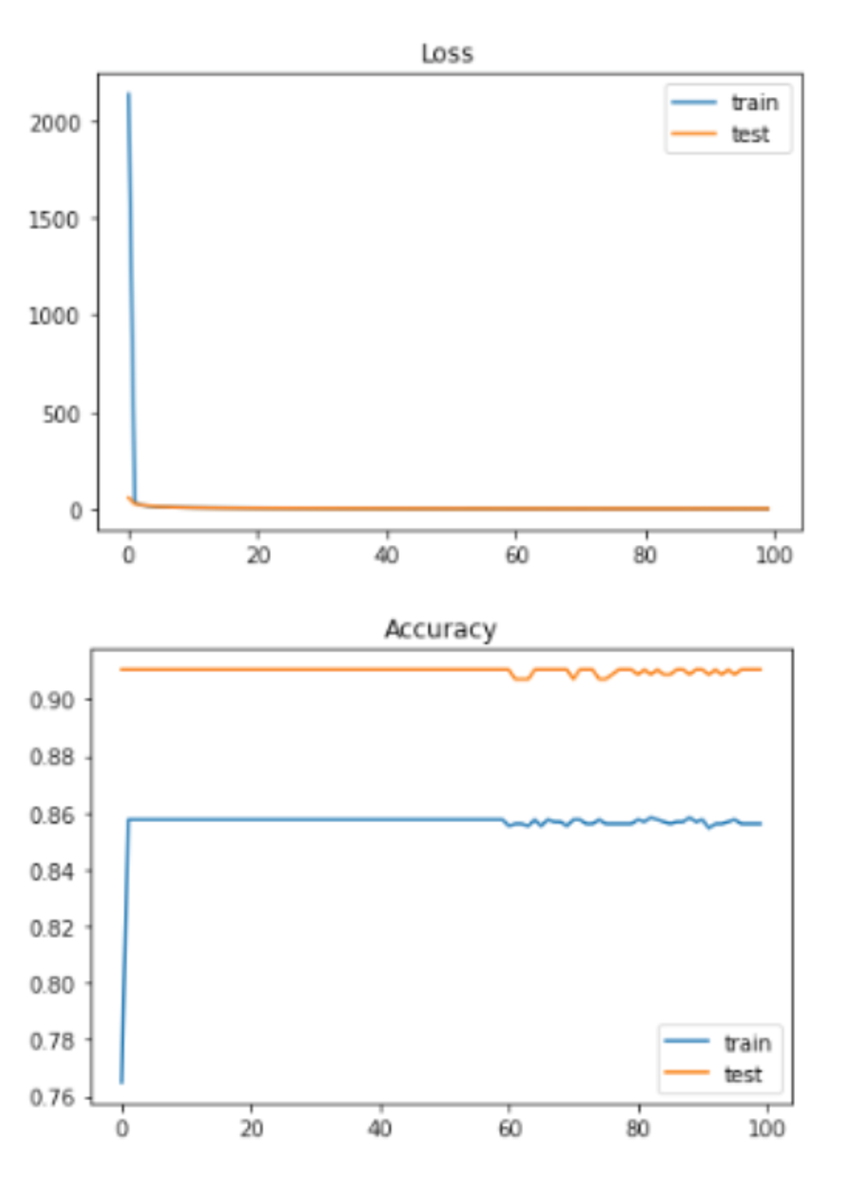
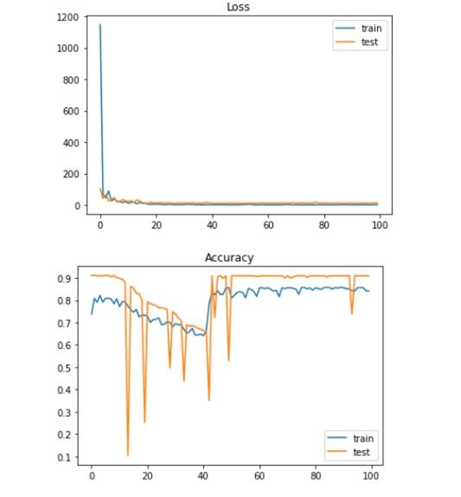
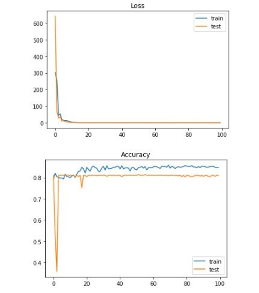
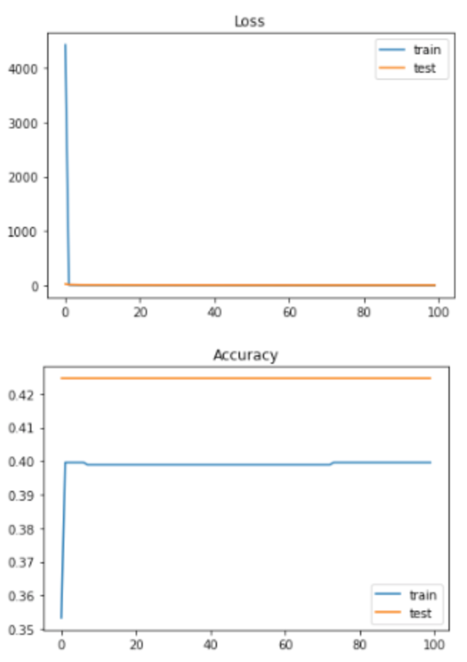
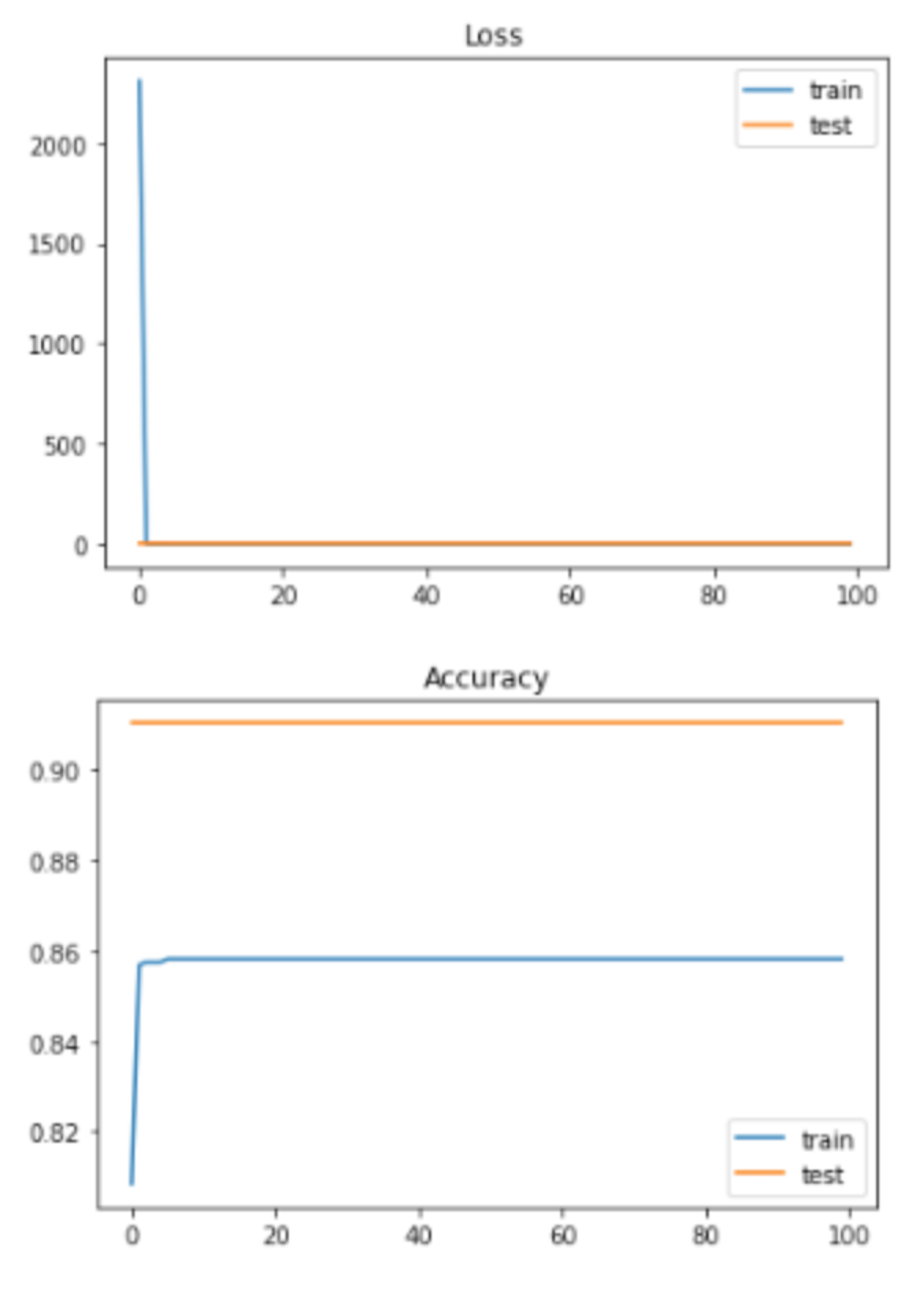
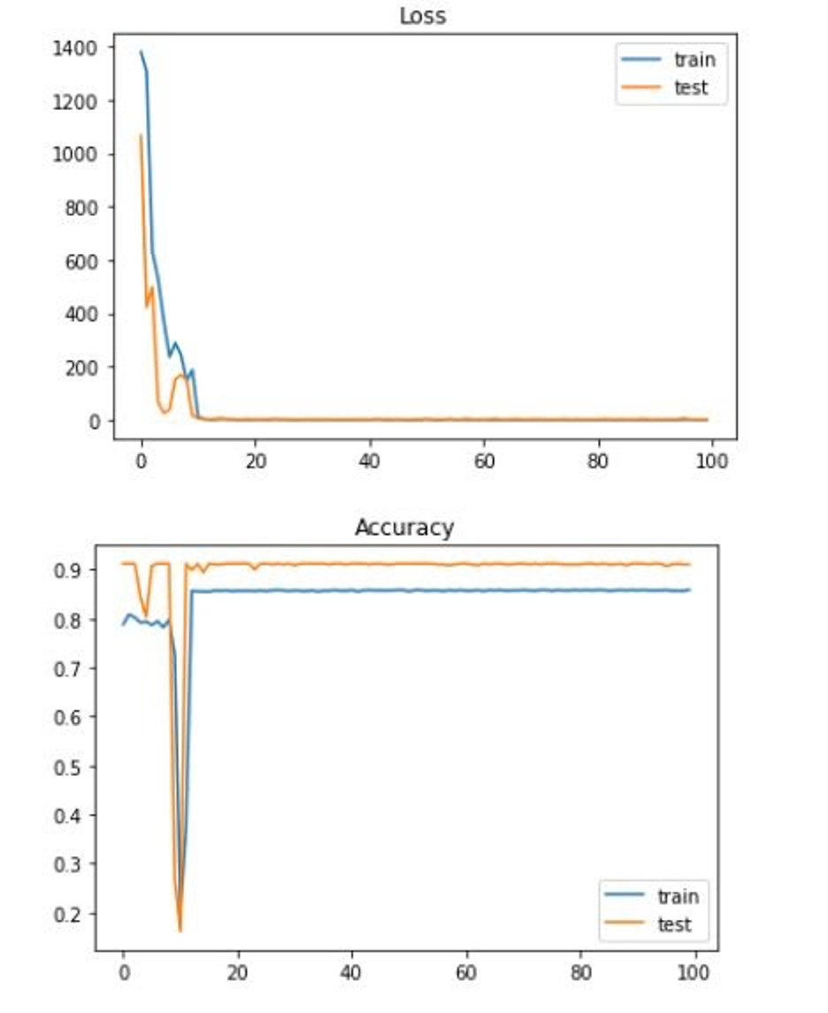
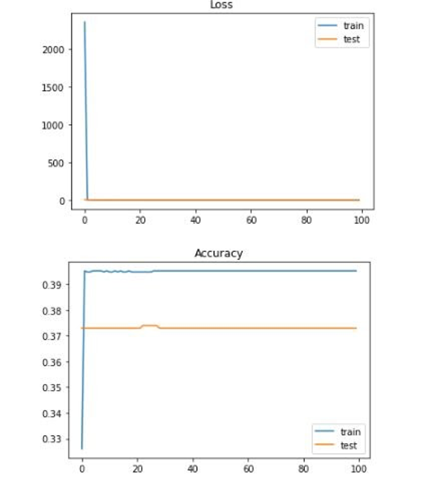
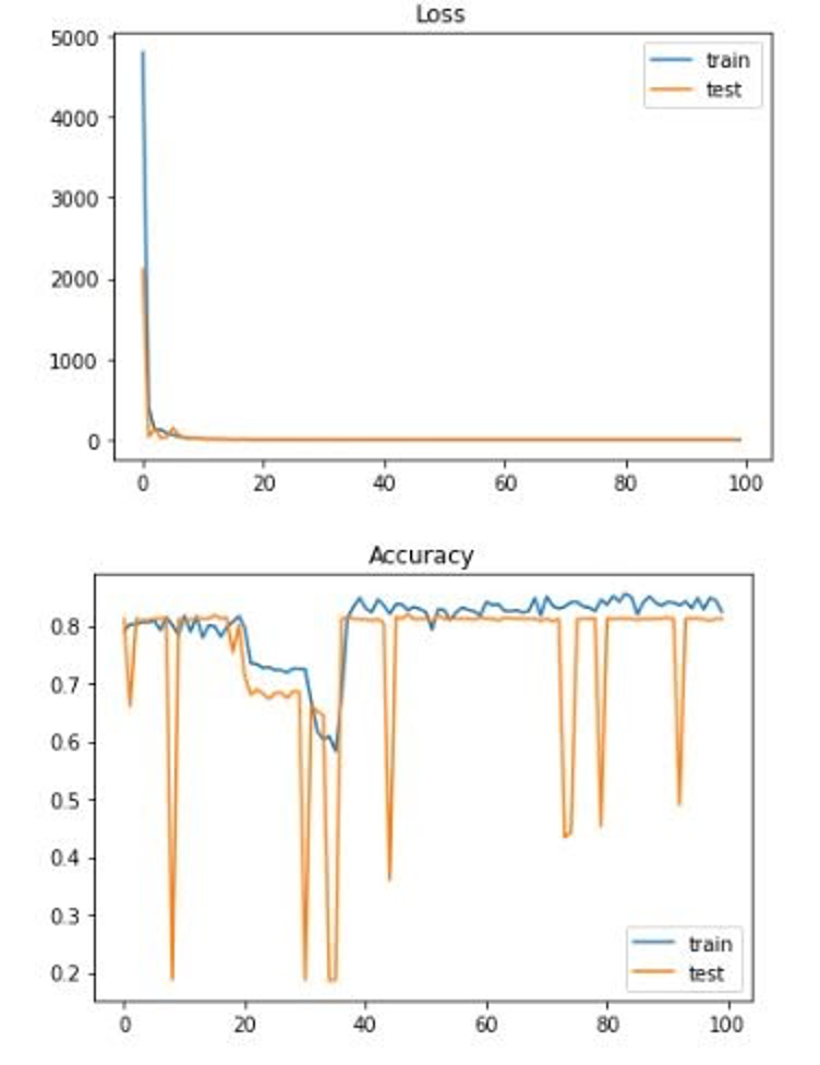
As discussed above, we ran our neural network over many different input feature size and output label size combinations. We first ran it with all 16 features mapping to 7 output labels; we then ran it with all 16 features mapping to 2 output labels; we then ran it with the 5 identified features from dimension reduction mapped to 7 output labels; finally, we ran it with the 5 identified features from dimension reduction mapped to 2 output labels. As discussed above, we ran this with our non-regrssed and our regressed dataset. We also experimented with a normalization layer to normalize the data. As expected, the 5 identified features from dimension reduction mapped to 2 output labels produced the best results and the highest accuracy with an accuracy of 92%. Something interesting, however, was that our normalized regressed data consistently produced worse results. Here is a look at the results for each of the many combinations:
Loss and Accuracy with all 16 features without regression mapped to 7 labels:
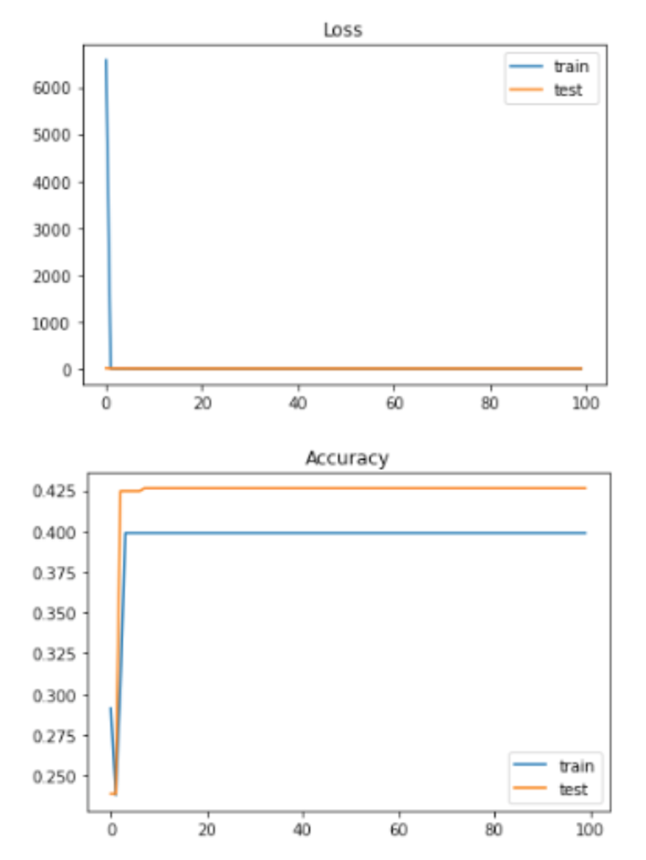
2 labels:
Loss and Accuracy with all 16 features with normalization and without regression mapped to 7 labels:
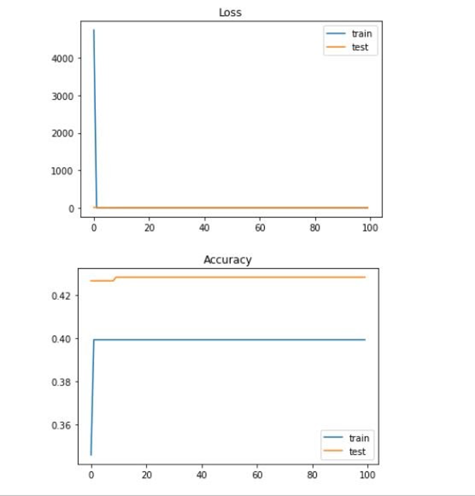
2 labels:
Loss and Accuracy with all 16 features with normalization and regression mapped to 7 labels:

2 labels:
Loss and Accuracy with top 5 features without regression mapped to 7 labels:
2 labels:
Loss and Accuracy with top 5 features with normalization and without regression mapped to 7 labels:

2 labels:
Loss and Accuracy with top 5 features with normalization and regression mapped to 7 labels:
2 labels:
While there is less granularity in this model, it is the result of there only being a limited number of data from the US (2,007 data points without regression and 3,200 data points with regression to be specific). If there were more data points, the original model would likely increase in accuracy. A few potential fixes include doing more searching around for some of our features to make them more specific for each county. Some of our features were only given at the state level and we had to apply the datapoint to every county in that state (which is obviously not accurate in the real world) as opposed to finding each county-specific datapoint. Additionally, to increase the number of datapoints, we could also look at finding data for regions even more specific than counties. There are just over 3,000 counties in the United States, but if we looked at zipcode for example, we would be looking at over 40,000 zipcodes and therefore over 40,000 datapoints. This would also allow our data to get more specific. Finding the features we would need for every zipcode, however, would likely be very difficult. Finally, we could re-examine the architecture of our neural network. Our neural network is rather simple, yet we are trying to solve a very complex problem. These are all things others interested in this problem should look into.
Decision Tree Results
As discussed above, we used a decision tree model to get greater insight into how factors correlate with poverty. Here are the results of running all 16 features mapped to 2 labels without regression and the corresponding feature importance levels:
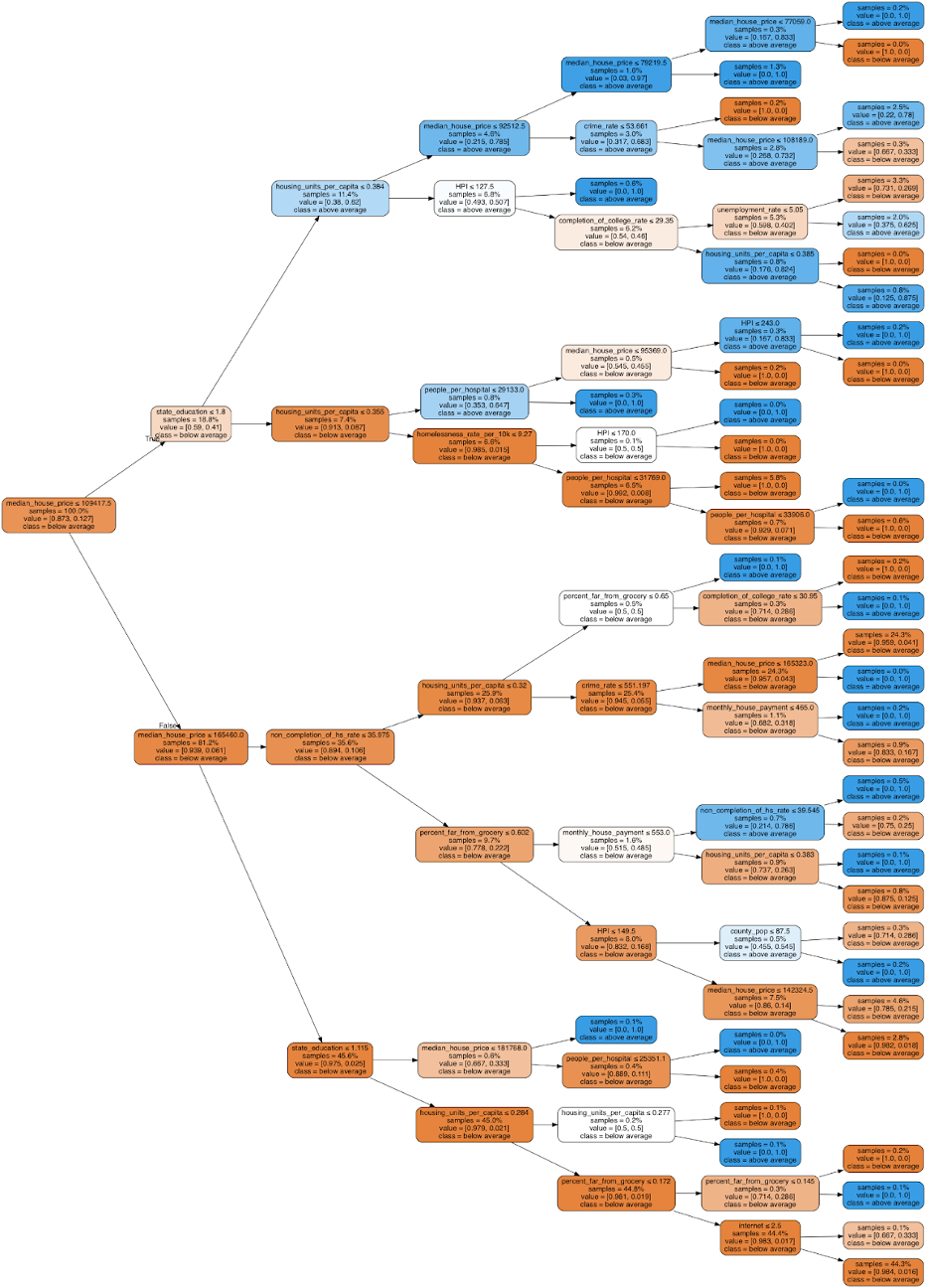
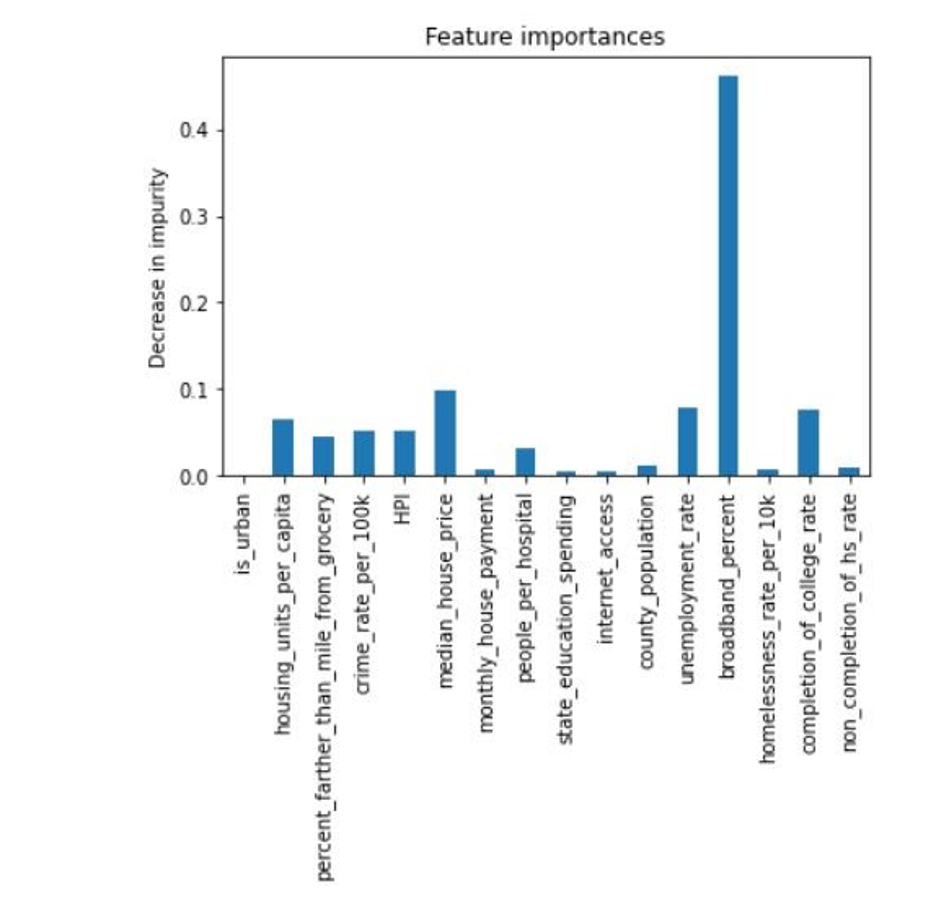
We achieved an 80% accuracy. Next, we ran the decision tree with all 16 features mapped to 2 labels with regression. Here are the results and the corresponding feature importance levels:

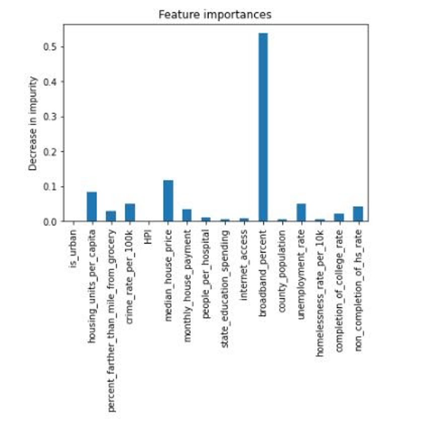
We achieved an 86% accuracy. As expected, the decision tree with the regressed data had a higher accuracy; however, both of these trees’ accuracies were noticably less than the neural network, which makes sense since decision trees cannot extrapolate data like neural networks can. Extrapolating data is especially important here as the ranges for the features are very wide and we have relatively few data points. As a result of these decision trees, we now know, for instance, that if the county’s median house price is between $110,000 and $165,000 and your non completion of high school rate is below 35% and there are less than .35 housing units per capita and less than 65% of people in the county are far from a grocery store, it is likely the county has an above average poverty level. Similar to the results of PCA, housing price information and broadband access seem to have a strong correlation to poverty. In addition, based on the results of our decision tree, state education funds appear important as well.
Discussion
It appears that the housing features (HPI, median_house_price, etc.) are the most dominant explaining features. Although this seems plausible, some of the other features that we hypothesized to have the most significant impact on poverty, such as unemployment rate and education level, did not have as much correlation to poverty as we expected. Additionally, the housing data does not do much in explaining the causes of poverty, despite the high correlation.
One of the reasons for the low correlation between education and poverty could be that we gathered education data at a state level, and then extrapolated that to the county level. This is not accurately representative of county population statistics, and hence anyone interested in further assessing these correlations should try to find datasets that give this data at the county level.
Additional potential issues with our models are that the datasets for the different features did not all come from the same time period. For instance, the housing data might be from 2020, but the grocery store data might be from 2017. Although we did not expect the trends to shift much over the time periods we have looked at, it might be worthwhile to consider data from the same, or relatively the same times.
Other things to consider is that it might be worthwhile to consider more features to achieve more granular predictions of the level of poverty. For this, one would have to find more datasets, clean that data, and train/test our models with this additional data. For example, as discussed above, if we had looked at zipcodes as opposed to counties, we would be working with over 40,000 datapoints as opposed to 3,200. One of the biggest problems with this, however, and also discussed above, is that there is a lack of data points, especially below the county level. Finding data at a level below counties is difficult if not impossible. As such, one would need to be extra careful in how they clean the data.
Conclusion
Both PCA and the decision tree noted that housing was an extremely important indicator for poverty. By looking at the decision tree our project produced, policy makers could decide to focus on building affordable housing and making sure there is enough for everyone. Increasing education and access to healthcare, as now both studies and our models show, is paramount as well. After adding the broadband access feature, we know that broadband access is also paramount to success in an increasingly online economy and education system. We hope that our project has provided some insights into the causal factors of poverty in the United States, and hopefully our research can be used by the relevant individuals to tackle this issue, or to further and provide a basis for their own research.
References
- “Analysis of Factors Contributing to Poverty in the United States: An Empirical Study” Dr. Andrew Ziegler, Jr., 2017, https://www.methodist.edu/wp-content/uploads/2018/09/mr2017_chioma.pdf
- “Income and Poverty in the United States: 2020.” The United States Census Bureau, 14 Sept. 2021, https://www.census.gov/library/publications/2021/demo/p60-273.html.
- “Poverty in America: Trends and Explanations” Hilary W. Hoynes, Marianne E. Page, and Ann Huff Stevens, 2006, https://gspp.berkeley.edu/assets/uploads/research/pdf/089533006776526102.pdf
- Saipe Unemployment data. United States Census Bureau. (n.d.). Retrieved November 17, 2021, from https://www.census.gov/data-tools/demo/saipe/#/?map_geoSelector=aa_c.
- Download the data. USDA ERS - Download the Data. (n.d.). Retrieved November 17, 2021, from https://www.ers.usda.gov/data-products/food-access-research-atlas/download-the-data.aspx
- Housing Units per capita. USDA ERS - Download the Data. (n.d.). Retrieved November 17, 2021, from https://www.ers.usda.gov/data-products/food-access-research-atlas/download-the-data.aspx
- Grocery Stores. USDA ERS - Download the Data. (n.d.). Retrieved November 17, 2021, from https://www.ers.usda.gov/data-products/food-access-research-atlas/download-the-data.aspx
- Federal Housing Finance Agency. (n.d.). Retrieved November 17, 2021, from https://www.fhfa.gov/DataTools/Downloads/Pages/House-Price-Index-Datasets.aspx.
- Jr, M. J. (2016, December 28). United States crime rates by County. Kaggle. Retrieved November 17, 2021, from https://www.kaggle.com/mikejohnsonjr/united-states-crime-rates-by-county.
- County median home prices and monthly mortgage payment. www.nar.realtor. (n.d.). Retrieved November 17, 2021, from https://www.nar.realtor/research-and-statistics/housing-statistics/county-median-home-prices-and-monthly-mortgage-payment.
- Hospital Compare. (n.d.). Hospital General Information. PQDC. Retrieved November 17, 2021, from https://data.cms.gov/provider-data/dataset/xubh-q36u.
- Garrard, R. (2018, August 29). U.S. educational finances. Kaggle. Retrieved November 17, 2021, from https://www.kaggle.com/noriuk/us-educational-finances?select=states.csv.
- Bureau, U. S. C. (2021, October 8). Computer and internet access in the United States: 2012. Census.gov. Retrieved November 17, 2021, from https://www.census.gov/data/tables/2012/demo/computer-internet/computer-use-2012.html.
- Bureau, U. S. C. (2021, October 8). County population totals: 2010-2020. Census.gov. Retrieved November 17, 2021, from https://www.census.gov/programs-surveys/popest/technical-documentation/research/evaluation-estimates/2020-evaluation-estimates/2010s-counties-total.html.
- Shirahatti, A. (2020, April 29). US unemployment dataset (2010 - 2020). Kaggle. Retrieved November 17, 2021, from https://www.kaggle.com/aniruddhasshirahatti/us-unemployment-dataset-2010-2020.
- Umerkk12. (2021, January 20). Homelessness in US. Kaggle. Retrieved November 17, 2021, from https://www.kaggle.com/umerkk12/homelessness-in-us.
- Education. USDA ERS - Data Products. (n.d.). Retrieved November 17, 2021, from https://data.ers.usda.gov/reports.aspx?ID=17829.
- CMS. (n.d.). MMCO statistical & analytic reports - Annual Release. CMS. Retrieved November 17, 2021, from https://www.cms.gov/Medicare-Medicaid-Coordination/Medicare-and-Medicaid-Coordination/Medicare-Medicaid-Coordination-Office/Analytics.
- SNAP benefits. USDA ERS - Download the Data. (n.d.). Retrieved November 17, 2021, from https://www.ers.usda.gov/data-products/food-access-research-atlas/download-the-data.aspx.
- Broadband County Data. Retrieved December 1st, 2021, from https://techdatasociety.asu.edu/broadband-data-portal/dataaccess/countydata
- Local Area Unemployment Statistics. Retrieved December 1st, 2021, from https://www.bls.gov/lau/